Client
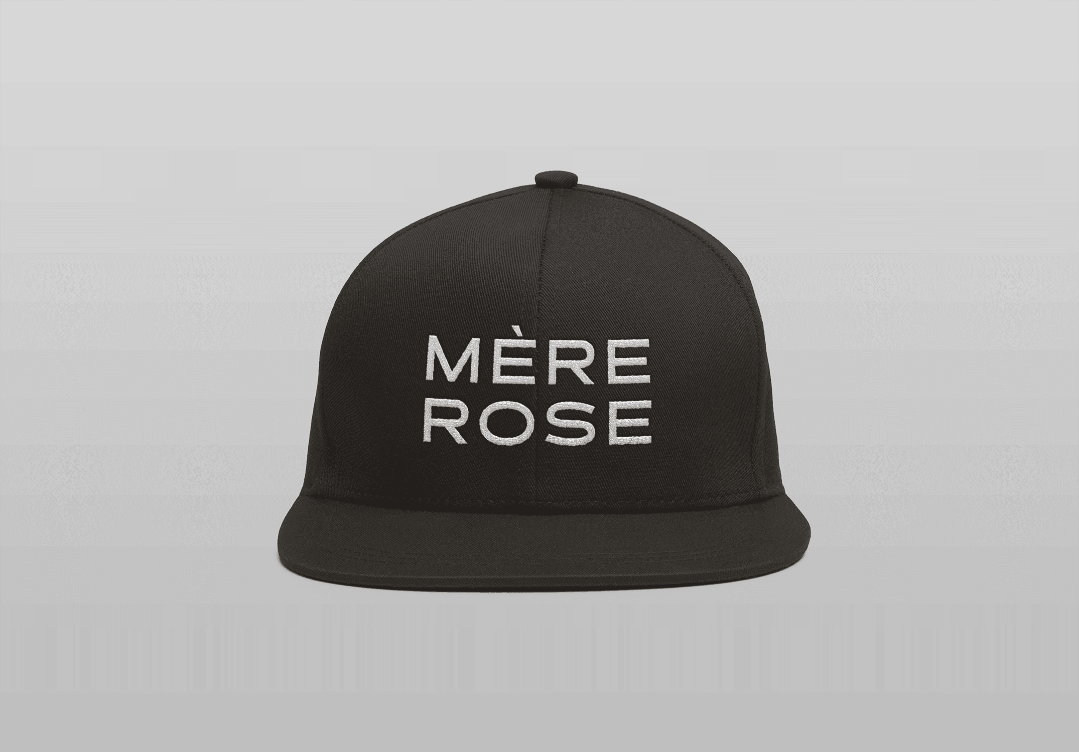
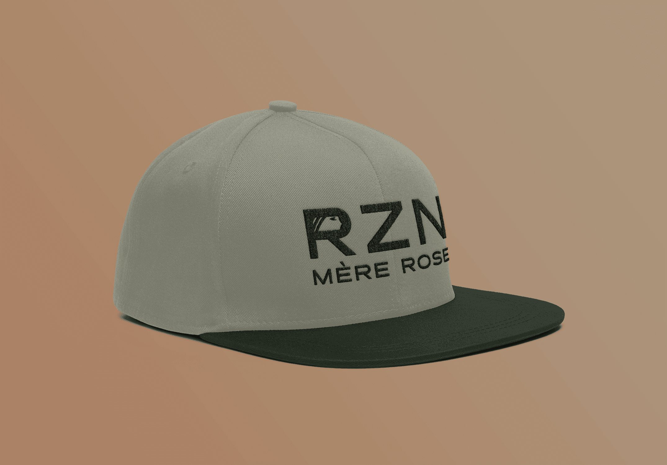
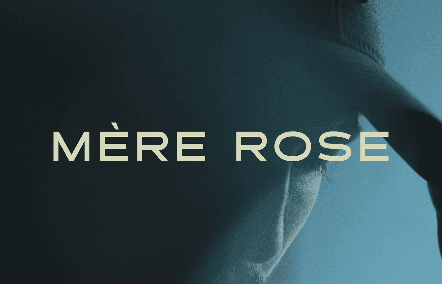
Mere Rose
Year
2025
Services
Branding and Identity Design
Logo Design
Mére Rose is an apparel company based out of New York, New York. This project entailed logo design as part of a larger, cohesive brand and visual identity design.
Mére Rose is a company created to honor the client's late mother, who passed of breast cancer. The logo combines a rose flower with roots spreading beneath it. The design is built using three lines to represent the number of sons in the family. The flower stretches down to the roots, which symbolize the importance of family and the client's mother’s strength. The roots spread out beneath the flower represent kindness and there is a woman’s face integrated into the flower petal.
This brand features numerous badge style alternate logos and a bold sans-serif font to balance the fairly detailed logo.